For the past week, nearly all of my mental energy has gone into the Early Warning Project and a paper for the upcoming APSA Annual Meeting here in Washington, DC. Over the weekend, though, I found some time for a toy project on forecasting pro-football games. Here are the results.
The starting point for this toy project is a pairwise wiki survey that turns a crowd’s beliefs about relative team strength into scalar ratings. Regular readers will recall that I first experimented with one of these before the 2013-2014 NFL season, and the predictive power wasn’t terrible, especially considering that the number of participants was small and the ratings were completed before the season started.
This year, to try to boost participation and attract a more knowledgeable crowd of respondents, I paired with Trey Causey to announce the survey on his pro-football analytics blog, The Spread. The response has been solid so far. Since the survey went up, the crowd—that’s you!—has cast nearly 3,400 votes in more than 100 unique user sessions (see the Data Visualizations section here).
The survey will stay open throughout the season, but that doesn’t mean it’s too early to start seeing what it’s telling us. One thing I’ve already noticed is that the crowd does seem to be updating in response to preseason action. For example, before the first round of games, I noticed that the Baltimore Ravens, my family’s favorites, were running mid-pack with a rating of about 50. After they trounced the defending NFC champion 49ers in their preseason opener, however, the Ravens jumped to the upper third with a rating of 59. (You can always see up-to-the-moment survey results here, and you can cast your own votes here.)
The wiki survey is a neat way to measure team strength. On their own, though, those ratings don’t tell us what we really want to know, which is how each game is likely to turn out, or how well our team might be expected to do this season. The relationship between relative strength and game outcomes should be pretty strong, but we might want to consider other factors, too, like home-field advantage. To turn a strength rating into a season-level forecast for a single team, we need to consider the specifics of its schedule. In game play, it’s relative strength that matters, and some teams will have tougher schedules than others.
A statistical model is the best way I can think to turn ratings into game forecasts. To get a model to apply to this season’s ratings, I estimated a simple linear one from last year’s preseason ratings and the results of all 256 regular-season games (found online in .csv format here). The model estimates net score (home minus visitor) from just one feature, the difference between the two teams’ preseason ratings (again, home minus visitor). Because the net scores are all ordered the same way and the model also includes an intercept, though, it implicitly accounts for home-field advantage as well.
The scatterplot below shows the raw data on those two dimensions from the 2013 season. The model estimated from these data has an intercept of 3.1 and a slope of 0.1 for the score differential. In other words, the model identifies a net home-field advantage of 3 points—consistent with the conventional wisdom—and it suggests that every point of advantage on the wiki-survey ratings translates into a net swing of one-tenth of a point on the field. I also tried a generalized additive model with smoothing splines to see if the association between the survey-score differential and net game score was nonlinear, but as the scatterplot suggests, it doesn’t seem to be.

2013 NFL Games Arranged by Net Game Score and Preseason Wiki Survey Rating Differentials
In sample, the linear model’s accuracy was good, not great. If we convert the net scores the model postdicts to binary outcomes and compare those postdictions to actual outcomes, we see that the model correctly classifies 60 percent of the games. That’s in sample, but it’s also based on nothing more than home-field advantage and a single preseason rating for each team from a survey with a small number of respondents. So, all things considered, it looks like a potentially useful starting point.
Whatever its limitations, that model gives us the tool we need to convert 2014 wiki survey results into game-level predictions. To do that, we also need a complete 2014 schedule. I couldn’t find one in .csv format, but I found something close (here) that I saved as text, manually cleaned in a minute or so (deleted extra header rows, fixed remaining header), and then loaded and merged with a .csv of the latest survey scores downloaded from the manager’s view of the survey page on All Our Ideas.
I’m not going to post forecasts for all 256 games—at least not now, with three more preseason games to learn from and, hopefully, lots of votes yet to be cast. To give you a feel for how the model is working, though, I’ll show a couple of cuts on those very preliminary results.
The first is a set of forecasts for all Week 1 games. The labels show Visitor-Home, and the net score is ordered the same way. So, a predicted net score greater than 0 means the home team (second in the paired label) is expected to win, while a predicted net score below 0 means the visitor (first in the paired label) is expected to win. The lines around the point predictions represent 90-percent confidence intervals, giving us a partial sense of the uncertainty around these estimates.

Week 1 Game Forecasts from Preseason Wiki Survey Results on 10 August 2014
Of course, as a fan of particular team, I’m most interested in what the model says about how my guys are going to do this season. The next plot shows predictions for all 16 of Baltimore’s games. Unfortunately, the plotting command orders the data by label, and my R skills and available time aren’t sufficient to reorder them by week, but the information is all there. In this plot, the dots for the point predictions are colored red if they predict a Baltimore win and black for an expected loss. The good news for Ravens fans is that this plot suggests an 11-5 season, good enough for a playoff berth. The bad news is that an 8-8 season also lies within the 90-percent confidence intervals, so the playoffs don’t look like a lock.

2014 Game-Level Forecasts for the Baltimore Ravens from 10 August 2014 Wiki Survey Scores
So that’s where the toy project stands now. My intuition tells me that the predicted net scores aren’t as well calibrated as I’d like, and the estimated confidence intervals surely understate the true uncertainty around each game (“On any given Sunday…”). Still, I think this exercise demonstrates the potential of this forecasting process. If I were a betting man, I wouldn’t lay money on these estimates. As an applied forecaster, though, I can imagine using these predictions as priors in a more elaborate process that incorporates additional and, ideally, more dynamic information about each team and game situation over the course of the season. Maybe my doppelganger can take that up while I get back to my day job…
Postscript. After I published this post, Jeff Fogle suggested via Twitter that I compare the Week 1 forecasts to the current betting lines for those games. The plot below shows the median point spread from an NFL odds-aggregating site as blue dots on top of the statistical forecasts already shown above. As you can see, the statistical forecasts are tracking the betting lines pretty closely. There’s only one game—Carolina at Tampa Bay—where the predictions from the two series fall on different sides of the win/loss line, and it’s a game the statistical model essentially sees as a toss-up. It’s also reassuring that there isn’t a consistent direction to the differences, so the statistical process doesn’t seem to be biased in some fundamental way.
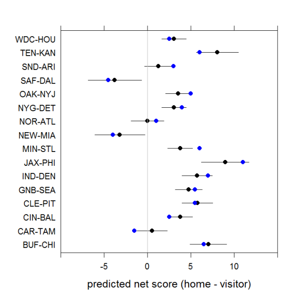
Week 1 Game-Level Forecasts Compared to Median Point Spread from Betting Sites on 11 August 2014