A Postscript on Measuring Change Over Time in Freedom in the World

After publishing yesterday’s post on Freedom House’s latest Freedom in the World report (here), I thought some more about better ways to measure what I think Freedom House implies it’s measuring with its annual counts of country-level gains and declines. The problem with those counts is that they don’t account for the magnitude of the changes they represent. That’s like keeping track of how a poker player is doing by counting bets won and bets lost without regard to their value. If we want to assess the current state of the system and compare it earlier states, the size of those gains and declines matters, too.

With that in mind, my first idea was to sum the raw annual changes in countries’ “freedom” scores by year, where the freedom score is just the sum of those 7-point political rights and civil liberties indices. Let’s imagine a year in which three countries saw a 1-point decline in their freedom scores; one country saw a 1-point gain; and one country saw a 3-point gain. Using Freedom House’s measure, that would look like a bad year, with declines outnumbering gains 3 to 2. Using the sum of the raw changes, however, it would look like a good year, with a net change in freedom scores of +1.

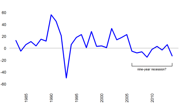
Okay, so here’s a plot of those sums of raw annual changes in freedom scores since 1982, when Freedom House rejiggered the timing of its survey.[1] I’ve marked the nine-year period that Freedom House calls out in its report as an unbroken run of bad news, with declines outnumbering gains every year since 2006. As the plot shows, when we account for the magnitude of those gains and losses, things don’t look so grim. In most of those nine years, losses did outweigh gains, but the net loss was rarely large, and two of the nine years actually saw net gains by this measure.

Annual global sums of raw yearly changes in Freedom House freedom scores (inverted), 1983-2014

Annual global sums of raw yearly changes in Freedom House freedom scores (inverted), 1983-2014

After I’d generated that plot, though, I worried that the sum of those raw annual changes still ignored another important dimension: population size. As I understand it, the big question Freedom House is trying to address with its annual report is: “How free is the world?” If we want to answer that question from a classical liberal perspective—and that’s where I think Freedom House is coming from—then individual people, not states, need to be our unit of observation.

Imagine a world with five countries where half the global population lives in one country and the other half is evenly divided between the other four. Now let’s imagine that the one really big country is maximally unfree while the other four countries are maximally free. If we compare scores (or changes in them) by country, things look great; 80 percent of the world is super-free! Meanwhile, though, half the world’s population lives under total dictatorship. An international relations theorist might care more about the distribution of states, but a liberal should care more about the distribution of people.

To take a look at things from this perspective, I decided to generate a scalar measure of freedom in the world system that sums country scores weighted by their share of the global population.[2] To make the result easier to interpret, I started by rescaling the country-level “freedom scores” from 14-2 to 0-10, with 10 indicating most free. A world in which all countries are fully free (according to Freedom House) would score a perfect 10 on this scale, and changes in large countries will move the index more than changes in small ones.

Okay, so here’s a plot of the results for the entire run of Freedom House’s data set, 1972–2014. (Again, 1981 is missing because that’s when Freedom House paused to align their reports with the calendar year.)  Things look pretty different than they do when we count gains and declines or even sum raw changes by country, don’t they?

A population-weighted annual scalar measure of freedom in the world, 1972-2014

A population-weighted annual scalar measure of freedom in the world, 1972-2014

The first thing that jumped out at me were those sharp declines in the mid-1970s and again in the late 1980s and early 1990s. At first I thought I must have messed up the math, because everyone knows things got a lot better when Communism crumbled in Eastern Europe and the Soviet Union, right? It turns out, though, that those swings are driven by changes in China and India, which together account for approximately one-third of the global population. In 1989, after Tienanmen Square, China’s score dropped from a 6/6 (or 1.67 on my 10-point scalar version) to 7/7 (or 0). At the time, China contained nearly one-quarter of the world’s population, so that slump more than offsets the (often-modest) gains made in the countries touched by the so-called fourth wave of democratic transitions. In 1998, China inched back up to 7/6 (0.83), and the global measure moved with it. Meanwhile, India dropped from 2/3 (7.5) to 3/4 (5.8) in 1991, and then again from 3/4 to 4/4 (5.0) in 1993, but it bumped back up to 2/4 (6.67) in 1996 and then 2/3 (7.5) in 1998. The global gains and losses produced by the shifts in those two countries don’t fully align with the conventional narrative about trends in democratization in the past few decades, but I think they do provide a more accurate measure of overall freedom in the world if we care about people instead of states, as liberalism encourages us to do.

Of course, the other thing that caught my eye in that second chart was the more-or-less flat line for the past decade. When we consider the distribution of the world’s population across all those countries where Freedom House tallies gains and declines, it’s hard to find evidence of the extended democratic recession they and others describe. In fact, the only notable downturn in that whole run comes in 2014, when the global score dropped from 5.2 to 5.1. To my mind, that recent downturn marks a worrying development, but it’s harder to notice it when we’ve been hearing cries of “Wolf!” for the eight years before.

NOTES

[1] For the #Rstats crowd: I used the slide function in the package DataCombine to get one-year lags of those indices by country; then I created a new variable representing the difference between the annual score for the current and previous year; then I used ddply from the plyr package to create a data frame with the annual global sums of those differences. Script on GitHub here.

[2] Here, I used the WDI package to get country-year data on population size; used ddply to calculate world population by year; merged those global sums back into the country-year data; used those sums as the denominator in a new variable indicating a country’s share of the global population; and then used ddply again to get a table with the sum of the products of those population weights and the freedom scores. Again, script on GitHub here (same one as before).

No, Democracy Has Not Been Discarded

Freedom House released the latest iteration of its annual Freedom in the World report yesterday (PDF) with the not-so-subtle subtitle “Discarding Democracy: Return to the Iron Fist.” The report starts like this (emphasis in original):

In a year marked by an explosion of terrorist violence, autocrats’ use of more brutal tactics, and Russia’s invasion and annexation of a neighboring country’s territory, the state of freedom in 2014 worsened significantly in nearly every part of the world.

For the ninth consecutive year, Freedom in the World, Freedom House’s annual report on the condition of global political rights and civil liberties, showed an overall decline. Indeed, acceptance of democracy as the world’s dominant form of government—and of an international system built on democratic ideals—is under greater threat than at any point in the last 25 years.

Even after such a long period of mounting pressure on democracy, developments in 2014 were exceptionally grim. The report’s findings show that nearly twice as many countries suffered declines as registered gains, 61 to 33, with the number of gains hitting its lowest point since the nine-year erosion began.

Once again, I’m going to respond to the report’s release by arguing that things aren’t nearly as bad as Freedom House describes them, even according to their own data. As I see it, the nine-year trend of “mounting pressure on democracy” isn’t really much of a thing, and it certainly hasn’t brought the return of the “iron fist.”

Freedom House measures freedom on two dimensions: political rights and civil liberties. Both are measured on a seven-point scale, with lower numbers indicating more freedom. (You can read more about the methodology here.) I like to use heat maps to visualize change over time in the global distribution of countries on these scales. In these heat maps, the quantities being visualized are the proportion of countries worldwide landing in each cell of the 7 x 7 grid defined by juxtaposing those two scales. The darker the color, the higher the proportion.

Let’s start with one for 1972, the first year Freedom House observes and just before the start of the so-called third wave of democratic transitions, to establish a baseline. At this point, the landscape has two distinct peaks, in the most– and least-free corners, and authoritarian regimes actually outnumber democracies.

fhm.1972

Okay, now let’s jump ahead to 1986, the eve of what some observers describe as the fourth wave of democratic transitions that swept the Warsaw Pact countries and sub-Saharan Africa. At this point, the world doesn’t look much different. The “least free” peak (lower left) has spread a bit, but there are still an awful lot of countries on that side of the midline, and the “most free” peak (upper right) is basically unchanged.

fhm.1986

A decade later, though, things look pretty different. By 1995, the “most free” peak has gotten taller and broader, the “least free” peak has eroded further, and there’s now a third peak of sorts in the middle, centered on 4/4.

fhm.1995

Jump ahead another 10 years, to 2005, and the landscape has tilted decisively toward democracy. The “least free” peak is no more, the bump in the middle has shifted up and right, and the “most free” peak now dominates the landscape.

fhm.2005

That last image comes not long before the run of nine years of consecutive declines in freedom described in the 2015 report. From the report’s subtitle and narrative, you might think the landscape had clearly shifted—maybe not all the way back to the one we saw in the 1970s or even the 1980s, but perhaps to something more like the mid-1990s, when we still had a clear authoritarian peak and a lot of countries seemed to be sliding between the two poles. Well, here’s the actual image:

fhm.2014

That landscape looks a lot more like 2005 than 1995, and it looks nothing like the 1970s or 1980s. The liberal democratic peak still dominates, and the authoritarian peak is still gone. The clumps at 3/3 and 6/5 seem to have slumped a little in the wrong direction, but there are not significant new accretions in any spot. In a better world, we would have seen continued migration toward the “most free” corner over the past decade, but the absence of further improvement is hardly the kind of rollback that phrases like “discarding democracy” and “return to the iron fist” seem to imply.

Freedom House’s topline message is also belied by the trend over time in its count of electoral democracies—that is, countries that hold mostly free and fair elections for the offices that actually make policy. By Freedom House’s own count, the number of electoral democracies around the world actually increased by three in 2014 to an all-time high of 125, or more than two-thirds of all countries. Here’s the online version of their chart of that trend (from this page):

fh.electoraldemocracies.2015

Again, I’m having a hard time seeing democracy being “discarded” in that plot.

So how can both of these things be true? How can the number of electoral democracies grow over a period when annual declines in freedom scores outnumber annual gains?

The answer is that those declines are often occurring in countries that are already governed by authoritarian regimes, and they are often small in size. Meanwhile, some countries are still making jumps from autocracy to democracy that are usually larger in scale than the incremental declines and thus mostly offset the losses in the global tally. So, while those declines are surely bad for the citizens suffering through them, they rarely move countries from one side of the ledger to the other, and they have only a modest effect on the overall level of “freedom” in the system.

This year’s update on the Middle East shows what I mean. In its report, Freedom House identifies only one country in that region that made significant gains in freedom in 2014—Tunisia—against seven that saw declines: Bahrain, Egypt, Iraq, Lebanon, Libya, Syria, and Yemen. All seven of those decliners were already on the authoritarian side of the ledger going into 2014, however, and only four of the declines were large enough to move a country’s rating on one or both of the relevant indices. Meanwhile, Tunisia jumped up two points on political rights in one year, and since 2011 its combined score (political rights + civil liberties) has gone up eight points, from 12 to 4. We see similar patterns in the declines in Eurasia, where nearly all countries already clustered around the “least free” pole, and sub-Saharan Africa, where only one country moved down into Freedom House’s Not Free category (Uganda) and two returned to the set of electoral democracies after holding reasonably fair and competitive elections (Guinea-Bissau and Madgascar).

In short, I continue to believe that Freedom House’s presentation of trends over time in political rights and civil liberties is much gloomier than the world its own data portray. Part of me feels like a jerk for saying so, because I recognize that Freedom House’s messaging is meant to be advocacy, not science, and I support the goals that advocacy is meant to achieve. As a social scientist, though, I also think it’s important that our analyses and decisions be informed by as accurate a sketch of the world as we can draw, so I will keep mumbling into this particular gale.

PS. If you want Freedom House’s data in .csv format, I’ve posted a version of them—including the 2014 updates, which I entered by hand this morning—on my Google Drive, here.

PPS. If you’re curious where I think these trends might be headed in the next 10 years, see this recent post.

PPPS. The day after I ran this post, I published another in which I tried to think of better ways to measure what Freedom House purports to describe in its annual reports. You can read it here.

The Evolution of Political Regimes, Freedom House Version

A year and a half ago, I posted animated heat maps that used Polity data to look at the evolution of national political regimes at the global level over the past two centuries (here and here). Polity hasn’t posted new data for 2013 yet, but Freedom House (sort of) has, so I thought I’d apply the same template to Freedom House’s measures of political rights and civil liberties and see what stories emerged.

The result is shown below. Here are a few things to keep in mind when watching it:

  • The cells in each frame represent annual proportions of all national political regimes worldwide. The darker the gray, the larger the share of the world’s regimes that year.
  • Freedom House’s historical depth is much shallower than Polity’s—coverage begins in 1972 instead of 1800—so we’re missing most of the story the Polity version told about the advent and spread of contemporary democracy in the 19th and 20th centuries. Oh, well.
  • The order of the Freedom House indices is counter-intuitive. One is most liberal (“freest”) and 7 is least. So in these plots, the upper right-hand corner is where you’d find most of Europe and North America today, and the lower left-hand corner is where you’ll find what Freedom House calls “the worst of the worst.”
  • One year (1981) is missing because Freedom House made some changes to its process around that time that meant they effectively skipped a year.
  • For details on what the two measures are meant to represent and how they are produced, see Freedom House’s Methodology Fact Sheet.

freedomhouse.heatmap.20140213

Now here are a few things that occur to me when watching it.

  • The core trend is clear and unsurprising. Over the past four decades, national political regimes around the world have trended more liberal (see this post for more on that). We can see that here in the fading of the cells in the lower left and the flow of that color toward the upper right.
  • You have to look a little harder for it, but I think I can see the slippage that Freedom House emphasizes in its recent reports, too. Compared with the 1970s, 1980s, and even 1990s, the distributions of the past several years still look quite liberal, but it’s also evident that national political regimes aren’t marching inexorably into that upper right-hand corner. Whether that’s just the random part of a process that remains fundamentally unchanged or the start of a sustained slide from a historical peak, we’ll just have to wait and see. (My money’s on the former.)
  • These plots also show just how tightly coupled these two indices are. Most of the cells far from the heavily populated diagonal never register a single case. This visual pattern reinforces the idea that these two indices aren’t really measuring independent aspects of governance. Instead, they look more like two expressions of a common underlying process. (For deep thoughts on these measurement issues, see Munck and Verkuilen 2002 and Coppedge et al. 2011 [gated, sorry].)

You can find the R script used to produce this .gif on GitHub (here) and the data set used by that script on Google Drive (here). Freedom House hasn’t yet released the 2013 data in tabular format, so I typed those up myself and then merged the results with a table created from last year’s spreadsheet.

The Democratic Recession That *Still* Isn’t

Freedom House dropped its annual Freedom in the World report today, and its contents give me cause once more to bang a drum I’ve been banging for a while: democracy is not in retreat. Here are the numbers, are summarized by Freedom House:

The number of countries designated by Freedom in the World as Free in 2013 stood at 88, representing 45 percent of the world’s 195 polities and 40 percent of the global population. The number of Free countries decreased by two from the previous year’s report.

The number of countries qualifying as Partly Free stood at 59, or 30 percent of all countries assessed, and they were home to 25 percent of the world’s population. The number of Partly Free countries increased by one from the previous year.

A total of 48 countries were deemed Not Free, representing 25 percent of the world’s polities. The number of people living under Not Free conditions stood at 35 percent of the global population, though China accounts for more than half of this figure. The number of Not Free countries increased by one from 2012.

The number of electoral democracies rose by four to 122, with Honduras, Kenya, Nepal, and Pakistan acquiring the designation.

So, summing up: the global shares of countries designated Free, Partly Free, and Not Free remained more or less unchanged from 2012, while the share of countries designated as electoral democracies increased two percentage points, from 60.5 to 62.5 percent.

In its own topline judgments, Freedom House looks at the data from a different angle than I do, calling out the fact that the number of declines in scores on its Political Rights or Civil Liberties indices outstripped the number of gains for the eighth year in a row. This is factually true, but I think it’s also important to note that many of those declines are occurring in countries in the former Soviet Union and the Middle East that we already regard as authoritarian. In other words, this eight-year trend is not primarily the result of more and more democracies slipping into authoritarianism; instead, it’s more that many existing autocracies keep tightening the screws.

I don’t think it’s accidental that this eight-year trend has coincided with two waves of popular uprisings in the very regions where those erosions are most pronounced—the so-called Color Revolutions and Arab Awakening. A lot of that slippage has come from autocrats made anxious by democratic ferment in their own and neighboring societies. If we notice that correlation and allow ourselves to think longer term, I think there’s actually cause to be optimistic that these erosions will not hold indefinitely, at least not across the board. Oh, and let’s not forget about China.

It may also be true, as some have argued, that the quality of democracy is eroding in long-established electoral regimes in Europe and the Americas. If that is happening, though, it’s not showing up yet in Freedom House’s data. We can argue about whether those indices are sufficiently sensitive or properly tuned to pick up that kind of variation, and given the depth of concern around these issues right now, I think that’s a debate worth having. That said, the fact that these permutations don’t yet register on measures designed to compare the scope and scale of freedoms worldwide over the past 40 years should also remind us to keep those concerns in comparative perspective.

On the whole, I think Larry Diamond nailed it in a recent Economist-hosted debate on this issue:

Concern about the health of democracy is necessary to reform and improve it. Apathy permits the decay of democracy and could eventually bring its demise. But the fear that democracy may now be in global retreat is not simply overblown, it is wrong.

Singing the Missing-Data Blues

I’m currently in the throes of assembling data to use in forecasts on various forms of political change in countries worldwide for 2014. This labor-intensive process is the not-so-sexy side of “data science” that practitioners like to bang on about if you ask us, but I’m not going to do that here. Instead, I’m going to talk about how hard it is to find data sets that applied forecasters of rare events in international politics can even use in the first place. The steep data demands for predictive models mean that many of the things we’d like to include in our models get left out, and many of the data sets political scientists know and like aren’t useful to applied forecasters.

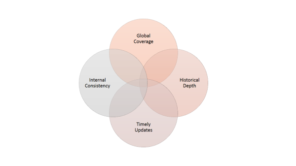
To see what I’m talking about, let’s assume we’re building a statistical model to forecast some rare event Y in countries worldwide, and we have reason to believe that some variable X should help us predict that Y. If we’re going to include X in our model, we’ll need data, but any old data won’t do. For a measure of X to be useful to an applied forecaster, it has to satisfy a few requirements. This Venn diagram summarizes the four I run into most often:

data.venn.diagram

First, that measure of X has to be internally consistent. Validity is much less of a concern than it is in hypothesis-testing research, since we’re usually not trying to make causal inferences or otherwise build theory. If our measure of X bounces around arbitrarily, though, it’s not going to provide much a predictive signal, no matter how important the concept underlying X may be. Similarly, if the process by which that measure of X is generated keeps changing—say, national statistical agencies make idiosyncratic revisions to their accounting procedures, or coders keep changing their coding rules—then models based on the earlier versions will quickly break. If we know the source or shape of the variation, we might be able to adjust for it, but we aren’t always so lucky.

Second, to be useful in global forecasting, a data set has to offer global coverage, or something close to it. It’s really as simple as that. In the most commonly used statistical models, if a case is missing data on one or more of the inputs, it will be missing from the outputs, too. This is called listwise deletion, and it means we’ll get no forecast for cases that are missing values on any one of the predictor variables. Some machine-learning techniques can generate estimates in the face of missing data, and there are ways to work around listwise deletion in regression models, too (e.g., create categorical versions of continuous variables and treat missing values as another category). But those workarounds aren’t alchemy, and less information means less accurate forecasts.

Worse, the holes in our global data sets usually form a pattern, and that pattern is often correlated with the very things we’re trying to predict. For example, the poorest countries in the world are more likely to experience coups, but they are also more likely not to be able to afford the kind of bureaucracy that can produce high-quality economic statistics. Authoritarian regimes with frustrated citizens may be more likely to experience popular uprisings, but many autocrats won’t let survey research firms ask their citizens politically sensitive questions, and many citizens in those regimes would be reluctant to answer those questions candidly anyway. The fact that our data aren’t missing at random compounds the problem, leaving us without estimates for some cases and screwing up our estimates for the rest. Under these circumstances, it’s often best to omit the offending data set from our modeling process entirely, even if the X it’s measuring seems important.

Third and related to no. 2, if our events are rare, then our measure of X needs historical depth, too. To estimate the forecasting model, we want as rich a library of examples as we can get. For events as rare as onsets of violent rebellion or episodes of mass killing, which typically occur in just one or a few countries worldwide each year, we’ll usually need at least a few decades’ worth of data to start getting decent estimates on the things that differentiate the situations where the event occurs from the many others where it doesn’t. Without that historical depth, we run into the same missing-data problems I described in relation to global coverage.

I think this criterion is much tougher to satisfy than many people realize. In the past 10 or 20 years, statistical agencies, academic researchers, and non-governmental organizations have begun producing new or better data sets on all kinds of things that went unmeasured or poorly measured in the past—things like corruption or inflation or unemployment, to name a few that often come up in conversations about what predicts political instability and change. Those new data sets are great for expanding our view of the present, and they will be a boon to researchers of the future. Unfortunately, though, they can’t magically reconstruct the unobserved past, so they still aren’t very useful for predictive models of rare political events.

The fourth and final circle in that Venn diagram may be both the most important and the least appreciated by people who haven’t tried to produce statistical forecasts in real time: we need timely updates. If I can’t depend on the delivery of fresh data on X before or early in my forecasting window, then I can’t update my forecasts while they’re still relevant, and the model is effectively DOA. If X changes slowly, we can usually get away with using the last available observation until the newer stuff shows up. Population size and GDP per capita are a couple of variables for which this kind of extrapolation is generally fine. Likewise, if the variable changes predictably, we might use forecasts of X before the observed values become available. I sometimes do this with GDP growth rates. Observed data for one year aren’t available for many countries until deep into the next year, but the IMF produces decent forecasts of recent and future growth rates that can be used in the interim.

Maddeningly, though, this criterion alone renders many of the data sets scholars have painstakingly constructed for specific research projects useless for predictive modeling. For example, scholars in recent years have created numerous data sets to characterize countries’ national political regimes, a feature that scores of studies have associated with variation in the risk of many forms of political instability and change. Many of these “boutique” data sets on political regimes are based on careful research and coding procedures, cover the whole world, and reach at least several decades or more into the past. Only two of them, though—Polity IV and Freedom House’s Freedom in the World—are routinely updated. As much as I’d like to use unified democracy scores or measures of authoritarian regime type in my models, I can’t without painting myself into a forecasting corner, so I don’t.

As I hope this post has made clear, the set formed by the intersection of these four criteria is a tight little space. The practical requirements of applied forecasting mean that we have to leave out of our models many things that we believe might be useful predictors, no matter how important the relevant concepts might seem. They also mean that our predictive models on many different topics are often built from the same few dozen “usual suspects”—not because we want to, but because we don’t have much choice. Multiple imputation and certain machine-learning techniques can mitigate some of these problems, but they hardly eliminate them, and the missing information affects our forecasts either way. So the next time you’re reading about a global predictive model on international politics and wondering why it doesn’t include something “obvious” like unemployment or income inequality or survey results, know that these steep data requirements are probably the reason.

What Darwin Teaches Us about Political Regime Types

Here’s a paragraph, from a 2011 paper by Ian Lustick, that I really wish I’d written. It’s long, yes, but it rewards careful reading.

One might naively imagine that Darwin’s theory of the “origin of species” to be “only” about animals and plants, not human affairs, and therefore presume its irrelevance for politics. But what are species? The reason Darwin’s classic is entitled Origin of Species and not Origin of the Species is because his argument contradicted the essentialist belief that a specific, finite, and unchanging set of categories of kinds had been primordially established. Instead, the theory contends, “species” are analytic categories invented by observers to correspond with stabilized patterns of exhibited characteristics. They are no different in ontological status than “varieties” within them, which are always candidates for being reclassified as species. These categories are, in essence, institutionalized ways of imagining the world. They are institutionalizations of difference that, although neither primordial nor permanent, exert influence on the futures the world can take—both the world of science and the world science seeks to understand. In other words, “species” are “institutions”: crystallized boundaries among “kinds”, constructed as boundaries that interrupt fields of vast and complex patterns of variation. These institutionalized distinctions then operate with consequences beyond the arbitrariness of their location and history to shape, via rules (constraints on interactions), prospects for future kinds of change.

This is one of the big ideas to which I was trying to allude in a post I wrote a couple of months ago on “complexity politics”, and in an ensuing post that used animated heat maps to trace gross variations in forms of government over the past 211 years. Political regime types are the species of comparative politics. They are “analytic categories invented by observers to correspond with stabilized patterns of exhibited characteristics.” In short, they are institutionalized ways of thinking about political institutions. The patterns they describe may be real, but they are not essential. They’re not the natural contours of the moon’s surface; they’re the faces we sometimes see in them.

video game taxonomy

Mary Goodden’s Taxonomy of Video Games

If we could just twist our mental kaleidoscopes a bit, we might find different things in the same landscape. One way to do that would be to use a different set of measures. For the past 20 years or so, political scientists have relied almost exclusively on the same two data sets—Polity and Freedom House’s Freedom in the World—to describe and compare national political regimes in anything other than prose. These data sets are very useful, but they are also profoundly conventional. Polity offers a bit more detail than Freedom House on specific features of national politics, but the two are essentially operationalizing the same assumptions about the underlying taxonomy of forms of government.

Given that fact, it’s hard to see how further distillations of those data sets might surprise us in any deep way. A new project called Varieties of Democracy (V-Dem) promises to bring fresh grist to the mill by greatly expanding the number of institutional elements we can track, but it is still inherently orthodox. Its creators aren’t trying to reinvent the taxonomy; they’re looking to do a better job locating individuals in the prevailing one. That’s a worthy and important endeavor, but it’s not going to produce the kind of gestalt shift I’m talking about here.

New methods of automated text analysis just might. My knowledge of this field is quite limited, but I’m intrigued by the possibilities of applying unsupervised learning techniques, such as latent Dirichlet allocation (LDA), to the problem of identifying political forms and associating specific cases with them. In contrast to conventional measurement strategies, LDA doesn’t oblige us to specify a taxonomy ahead of time and then look for instances of the things in it. Instead, LDA assumes there is an infinite mixture of overlapping but latent categories out there, and these latent categories are partially revealed by characteristic patterns in the ways we talk and write about the world.

Unsupervised learning is still constrained by the documents we choose to include and the language we use in them, but it should still help us find patterns in the practice of politics that our conventional taxonomies overlook. I hope to be getting some funding to try this approach in the near future, and if that happens, I’m genuinely excited to see what we find.

Democracy Is Not Fading Away

On September 15, the U.N. observed the International Day of Democracy, an occasion meant to encourage reflections on the state of democracy around the world and ways to promote and consolidate it. Many of the reflections I saw stuck with a theme that’s been sounded a lot in the past few years: democracy is on the defensive. In its annual Countries at the Crossroads report, for example, Freedom House asked if recent uprisings in the Arab world were producing a global swing toward democracy and good governance and concluded that they were not. “Declines far exceeded improvements” in the 35 countries the report covers, “in both number and scale.” That pessimistic conclusion echoed the tone of Freedom House’s Freedom in the World 2012 report, which warned of a “continued pattern of global backsliding.” According to their data, 2011 was “the sixth consecutive year in which countries with declines [in their political rights and civil liberties scores] outnumbered those with improvements.”

I’ve said it before, but I’ll say it again: best I can tell, these pessimistic assessments are mistaking predictable dips in the road for the slope of the longer route, which continues to point uphill. Advocacy groups like Freedom House are rightly concerned with making and then protecting gains in as many cases as possible, but I think that mission makes their analysis of recent churn more alarmist than the evidence warrants.

To see why recent reversals don’t necessarily mean that democracy is on the decline, we have to widen our lens. Looking back over the past few centuries, as Xavier Marquez and I both did in recent blog posts, the spread of democracy is breathtaking. Even when we narrow our lens to the past century, the gains are remarkable; a system of government that only appeared in some of the world’s richest countries before World War II is now the dominant form worldwide.

Of course, those long-term trends don’t necessarily mean that recent reversals aren’t the start of a long decline—past performance does not guarantee future returns and all that—but I’m pretty confident they aren’t. To see why, we need to narrow our vision even further, to the last 25 or so years. Take a look at the chart below, which plots annual counts of transitions to democracy (blue) and autocracy (red) in countries worldwide.* At this time scale, the most notable pattern is the cluster of transitions to democracy in the early 1990s, what many have called the “fourth wave” of democratization in the world.

Because the risk of democratic breakdown is not zero, any cluster of transitions to democracy is likely to produce a cluster of reversals. Other things being equal, a jump in the number at-risk individuals should eventually result in a jump in the number of “deaths.” From analysis of the survival of democratic regimes over the past half-century, we know that the risk of breakdown increases over the first decade or so of a new democracy’s lifespan, and most attempts at democracy end within about 15 years of their start. Knowing this about their life expectancy, we can predict that the cluster of democratic reversals should start arriving several years after the wave of transitions to democracy begins, and it should then recede once the more vulnerable of those new democracies have succumbed.

Looking back at the chart above with that information in hand, what surprises me is that the number of transitions to autocracy in the past 10-15 years hasn’t been higher. If anything, the incidence of democratic breakdown has been lower than we would have expected in the wake of that blue wave in the early 1990s, which significantly increased the stock of democracies at risk of failure.

We can see this more clearly by looking at annual event rates instead of raw counts, using the number of each event type in the numerator and the number of countries at risk of that event type in the denominator. The chart below does just that, with dots marking the annual observations and a line that smooths out some of the year-to-year variation. Here, it’s clearer that the rate of democratic breakdown has been lower in the post-Cold War period than it was during the Cold War, while the rate of transitions to democracy has held fairly steady. As Freedom House observes, the rate of breakdowns has risen a bit in the past several years, but it’s still remained much lower than it was in the 1960s and early 1970s. More important, some countries continue to transition to democracy each year, and the democracy bin continues to fill up just about as fast as it empties.

I understand where the advocates are coming from, and I realize that their regular ringing of the alarm may even be contributing to the positive trends these charts show. I also know that trends don’t last forever, and the patterns we see when we take this long view aren’t necessarily irreversible. I just think those patterns are more encouraging than we realize when we focus our attention on the worst and most recent stuff, as advocates are professionally inclined to do.

* The data set used in this post is on the Dataverse (here). The R script used to make the charts is on GitHub (here).

Wishful Thinking on Popular Uprisings

In a recent blog post that tries to draw lessons for today’s “democratic insurgents” from the triumph of Poland’s Solidarity movement, Freedom House’s Arch Puddington engages in what I see as a bit of wishful thinking about what determines the fate of nonviolent revolutions and how much influence foreign governments have over that process. In crediting Solidarity’s success to effective communication and external support, Puddington ignores the more powerful role played by favorable structural conditions. This tendency to view politics as a wide-open space in which the right strategy can produce any outcome desired is something of an American affliction, and I think it’s one we need to question more often.

Puddington starts his post on lessons from Poland by asserting that Solidarity’s success depended heavily on the extensive communications machine the movement built in the 1980s, an operation Puddington describes as “an independent, uncensored press that included serious political journals, regional newspapers, and mimeographed bulletins that covered events in a single industrial enterprise.”

This “press” was, of course, an illicit operation, and Puddington credits material support from the United States with keeping this worthy endeavor going in the face of state repression. “The United States was critical here,” he argues; “the Reagan administration, the new National Endowment for Democracy, and the labor movement all worked to ensure that Solidarity had the means to communicate with the Polish people.”

Importantly, Puddington also argues that the existence of this communications network was a necessary condition, but not a sufficient one, for the success of the Solidarity movement. The other essential ingredient was the inclusiveness of the message the movement chose to spread through the machine it had built. “If the Solidarity press offers a lesson for today’s freedom movements,” he argues, “it is in the organization’s determination to address its message to the entire population, and not simply to a narrow group of urban intellectuals…No audience was considered too small, insignificant, or hostile to ignore.”

From that analysis of the causes of Solidarity’s triumph, Puddington deduces that other nonviolent resistance movements stand a better chance of repeating the Polish movement’s success if they mimic its strategy of building a powerful communications machine and using it to reach out to all of their countrymen (and women!). Looking at the recent failures of “liberal democrats” in Egypt and Russia, Puddington diagnoses the absence of these ingredients as a major cause of their struggles.

The challenge of speaking to and winning over these ordinary citizens, who get their news from traditional sources, has baffled the advocates of liberal reform to date. Solidarity succeeded because its leaders were committed to communicating with the majority. Those who today claim the mantle of democracy in authoritarian settings are not likely to prevail—even with the smartest technologies—unless, like Solidarity, they develop a language and instrument to convey their message to the millions they have thus far failed to reach.

I think Puddington’s story about why Solidarity won mistakes marginal effects for root causes. In so doing, it echoes what I see as the losing side of a debate about the impact of “messaging” on American political campaigns. In an oldie-but-goodie blog post from September 2010, political scientist Brendan Nyhan cogently summarizes the problem this way:

More and more pundits are jumping on the Democrats/Obama-are-in-trouble-due-to-bad-messaging bandwagon…What we’re observing is a classic example of what you might call the tactical fallacy. Here’s how it works:

1. Pundits and reporters closely observe the behavior of candidates and parties, focusing on the tactics they use rather than larger structural factors.
2. The candidates whose tactics appear to be successful tend to win; conversely, those whose tactics appear to be unsuccessful tend to lose (and likewise with parties).
3. The media concludes that candidates won or lost because of their tactical choices.

The problem is that any reasonable political tactic chosen by professionals will tend to resonate in favorable political environments and fall flat in unfavorable political environments (compare Bush in ’02 to Bush ’06, or Obama in ’08 to Obama in ’09-’10). But that doesn’t mean the candidates are succeeding or failing because of the tactics they are using. While strategy certainly can matter on the margin in individual races, aggregate congressional and presidential election outcomes are largely driven by structural factors (the state of the economy, the number of seats held by the president’s party, whether it’s a midterm or presidential election year, etc.). Tactical success often is a reflection of those structural factors rather than an independent cause.

My interpretation of the roots of Solidarity’s success is closer to the structural story suggested by Nyhan’s critique than the strategic yarn Puddington spins. Among the countries of the Soviet bloc, Poland offered some of the most propitious conditions for democratization, with its history of elected government and resistance to Soviet and Communist rule; its relatively well-off and well-educated population; its large and well-organized urban working class; and its occasional bouts of experimentation with limited economic and political liberalization. In spite of these relatively favorable conditions, Solidarity failed in its initial attempt to topple the Communist regime in the early 1980s. The major change from that time to 1989 was not improved messaging; it was the withdrawal of the grim threat of Soviet intervention!

This conflation of coincidence with cause has important implications for policymakers trying to draw lessons from history. For example, Puddington credits the Reagan administration’s support for Solidarity’s communications with helping tip it to success and infers that this beneficent effect can be replicated by having the U.S. government invest in communications support for popular uprisings elsewhere.

But was U.S. support really so important in the Polish case? It’s true that the U.S. verbally and materially supported anti-Communist movements throughout Eastern Europe and in the USSR, and all of those regimes crumbled in the late 1980s. According to my reading of the literature, however, most academic observers of those events give very little credit for that outcome to foreign support for dissident movements. Instead, they largely agree in casting the unsustainability of the command economy and the dilemmas inherent in Soviet nationalities policy as the root cause of the USSR’s disintegration, and, in turn, they see the Soviet retreat from Eastern Europe as the crucial catalyst of regime change there. As John Lewis Gaddis describes in his biography of George Kennan, the U.S. was more often criticized by human-rights advocates for having done too little to support those dissidents over the years, essentially leaving them to make their own fate—which they eventually did, when conditions became more favorable to their cause.

More generally, I wonder if we’re coming to a point in our thinking about nonviolent revolutions that’s similar to the collective optimism about democratic transitions that prevailed in the early 1990s. At a time when authoritarian regimes were dropping like flies, theorizing about the causes of democratization swung away from the structural preconditions that were long thought to enable or constrain these transformations toward a more opportunistic mindset that saw political leadership and imagination as the limiting factors. This shift in scholarly work aligned nicely with policymakers’ desire to cement gains from their victory in the Cold War, and this intersection of beliefs and interests led to a surge in Western interventions in various “countries in transition.” The single work that best captures the zeitgeist of that time is probably Giuseppe Di Palma’s To Craft Democracies, a 1990 monograph that cheerleads, cajoles, and prescribes far more than it theorizes. As Di Palma optimistically proclaimed, “Democratization is ultimately a matter of political crafting;” instead of fixating on structural constraints, we need “to entertain and give account of the notion that democracies can be made (or unmade) in the act of making them.”

The wave of popular uprisings that has swept the world in 2011 and 2012 seems to be having a similar effect on our sense of what’s possible and our ability to shape it. From our collective surprise at the breadth and success of these movements, we infer that they were unpredictable. From their supposed unpredictability, we infer that they can happen anywhere, any time in a world with improved health and education and unprecedented opportunities for communication. In other words, structural conditions are no longer seen as such a limiting factor, and the chief barriers in most cases are thought to be the more plastic problems of strategy, will, and courage. In the role of Giuseppe di Palma, we now have Gene Sharp, whose sophisticated analysis of nonviolent resistance has been widely adopted—and, arguably, misinterpreted—as a virtual key that can unlock the door to democracy in any context, as long as it is properly applied.

Before we get carried too far away by this new sense of optimism, we would do well to step back and consider what actually happened to those countries in transition in the early 1990s. In fact, many of those countries never made it to democracy, and many of the ones that did have since reverted to authoritarian rule. Of the 15 Soviet successor states, only the three Baltic states have sustained liberal democratic government since 1991, and they were the last patch of land the USSR annexed. Even Eastern Europe has produced a mixed bag of results, with marginally democratic regimes in places like Albania and Bulgaria and recent backslides in Hungary and Romania in spite of their membership in NATO and the EU. In short, many of the supposed successes that propelled the optimism of the early 1990s now don’t look much like successes at all. With hindsight, we can see that the structural conditions we declared irrelevant for a while have ultimately reasserted themselves, and some tweaked version of the old regime has often prevailed.

Philosophically, I consider myself a liberal, and I would love to see nonviolent uprisings run all of the world’s remaining autocrats out of office as soon as possible. Analytically, however, I am an empiricist, and my 20 years of studying democratization and social movements tells me the deck is still pretty heavily stacked against these challengers. The collective action problems, elite resistance, and other sources of institutional inertia that have made it hard for these movements to succeed in the past have not been erased by economic development and the spread of new communications technologies. Kurt Schock and others have persuasively shown that structural constraints do not determine the emergence and outcomes of nonviolent uprisings and that movement strategy and tactics also matter, but as far as I know, no one ever really argued that they didn’t. The useful question is, “How much do they matter?”, to which my answer today is, “Less than Arch Puddington thinks.”

  • Follow me on Twitter

  • Follow Dart-Throwing Chimp on WordPress.com
  • Enter your email address to follow this blog and receive notifications of new posts by email.

    Join 13.6K other subscribers
  • Archives